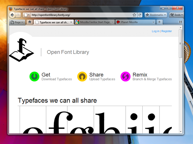
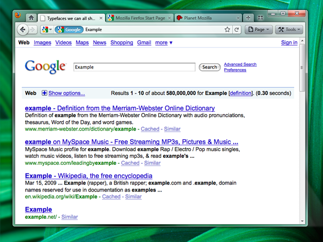
A few day ago, Firefox 3.7 mockups were discovered which made good use of Aero Glass available in Windows Vista and 7. Now, mockups for Firefox 4.0 have surfaced on the Mozilla Wiki which aren’t too different than the previous ones, but show some interesting new additions to the UI. Two versions are proposed, the conventional Tabs on bottom, and the Chrome like tabs on top. The stop and go buttons as well as the location of Tools button really seems inspired from Google Chrome. After Safari 4, Firefox seems to be taking some lessons from Chrome over browser UI.
Check out the complete mockups below. But let’s hope that they fix the memory issues with Firefox before changing the UI.
Initial Windows Theme Mockups for Firefox 4.0
Version A – Tabs-on-Bottom
 Possibly add a Bookmarks widget as an upfront replacement for the Bookmarks menu/Bookmarks toolbar (option to turn those on would remain).
Version B – Tabs-on-Top

The more contentious Tabs-on-Top concept.
Positives
- Save Vertical Space
- Efficiency/Remove Visual Complexity – Right now the tabs have to be connected to something. So we are adding an extra visual element for them to connect to.
- Shorter Mouse Distance to Page Controls
Negatives
- Breaks Consistency/Familiarity – Moving things confuses existing users.
- Title is MIA – With the space removed from the titlebar you only get the truncated version in the tab.
- Longer Mouse Distance to Tabs – Takes longer to mouse to a tab.
- Lost Space – Sandwiched in between the application icon and the window widgets you lose some space.
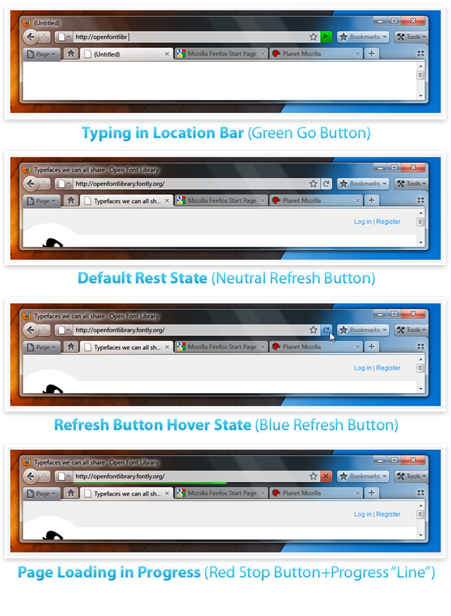
Combo Stop/Refresh/Go Button.
Attached at the end of the location bar.
- Turns green when you start typing.
- Blends with the location bar when at rest.
- Turns blue on hover.
- Turns red when a page is loading.
The proposed iconography is mostly colorless. Adding color to these temporary action driven buttons will make it more obvious something is going on.
The UI looks more and more like Chrome now. I’d rather see the tabs as a sidebar concept come to life. Though I like the idea of removing the Titlebar text from the top.
We can move the toolbar to the titlebar instead and save even more space specially for the netbooks which have very low vertical space available.
So far looks great.. lets see how it comes !
Not to be a spoil sport, but those are Firefox 3.7 mockups :D
In any case, they look beautiful in 7.
They are Firefox 4.0 mock ups, not 3.7 ones. Read would help :)