It’s rare that Google updates the looks of their home page or search engine result pages ( SERPs) but ever since Bing has stepped up the game with their different and useful designs, Google has been experimenting a lot lately. As part of their Google +1 release, they’ve accordingly made changes to other parts of their services, notably, Search.
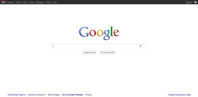
The most notable change is the black bar at the top of the Google Search landing page. It now has quick links to important Google Search destinations and Services although I can’t understand why Videos is a part of it when YouTube is clearly the better video search engine. ( Google Video search sucks, more on that in another article ).
The page also shows the account sign in a drop down panel which lets you sign into other accounts to switch to them or sign out. This first appeared in Gmail and other services. Search settings, advanced search and so on are housed under the gear icon in the top most right corner.
The buttons also look much cleaner and the voice search icon is embedded there in the text field.
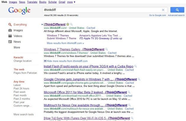
The black bar shows on the results page too ( not shown in below screenshot.) There’s a shade of gray for behind the logo, search field, and the big button.
The search selections in the left sidebar have changed with monochromatic colors. Red on selected but grayish when not. The usual search result filters are there. Another major change is the new Google Search button. I don’t remember the last time such a change took place. I predict this to be a major component of their design language and advertisement campaigns from now on – that is if this is a permanent change.

Apart from this, shockingly, Google hasn’t been showing TOO many ads during my testing (The same thing they tell website not to do, which they do themselves. Just see Gmail and the 20 ads it shows around your email – we know who is the biggest spammer here)
Overall, it’s a welcome change and, we for one, like how it looks. Now, only if they can fix the Google Mobile site design too which they’ve seriously messed up. I could always go Bing, though – they sure know how to create a better mobile search experience.

2 comments