Apple’s latest update for iPhone, iOS 16, comes with a ton of new bells and whistles aimed at making the Lock screen experience look and feel more refined and seamless. However, there is one change that a lot of users are unsatisfied with; Lock screen notifications.
By default, Lock screen notifications on iOS 16 appear as a stack at the bottom of your screen and you can scroll through them in a carousel format to expand them to a full-screen format. For most users, the new format can cause them to miss out on important notifications since they do not show up as a list. Luckily, you can easily revert Lock screen notifications back to the List format in a few simple steps.

How to revert Lock screen notifications back to the List format on iOS 16
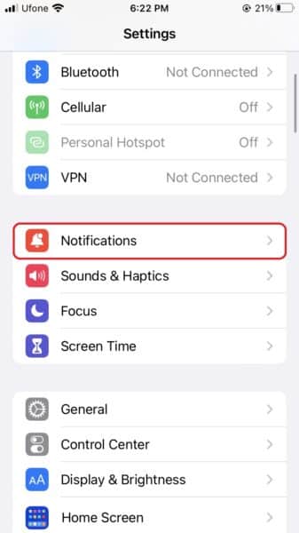
- Launch Settings from the Home screen of your iPhone.
- Go to Notifications.

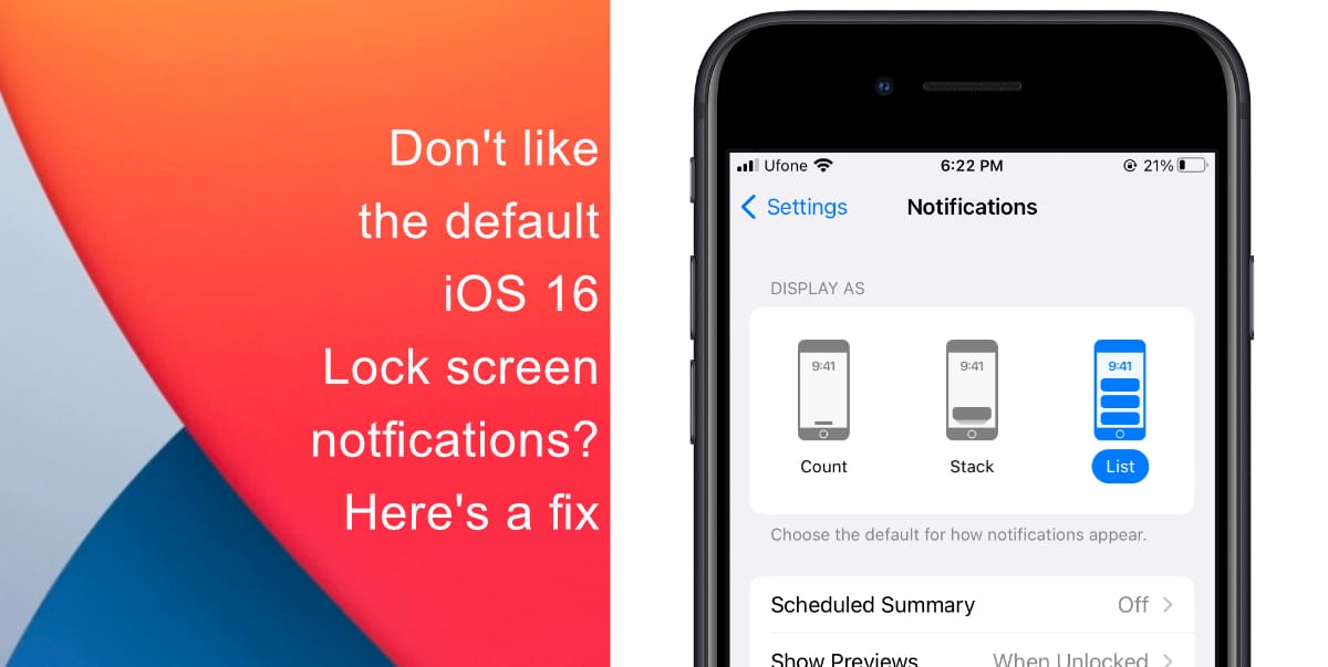
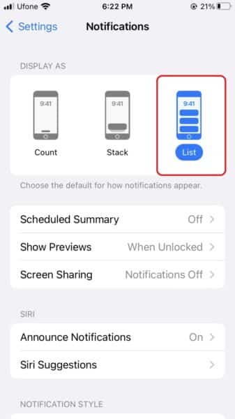
- Under Display As, you will see three options: Count, Stack, and List. Tap on List.

Now, your notifications will appear fully across your display rather than as a stack at the bottom of the screen that you have to comb through.
We hope this guide helped you learn to revert Lock screen notifications back to the List format on iOS 16. In case you have not installed iOS 16 on your iPhone yet, learn how to do so here. If you have any questions, let us know in the comments below.
Read more:
- iOS 16 hides the iMessage voice record button behind a menu
- How to edit an iMessage with iOS 16 on iPhone
- How to unsend an iMessage with iOS 16 on iPhone
- Want to enable Dark Mode on a Lock Screen wallpaper on iOS 16? Here’s how
- Third-party app widgets for iOS 16 lock screen not showing? Here’s a fix
- Battery drain after iOS 16 update? Here’s what you should do
- iPhone stuck in bootloop after iOS 16 update? Here’s a fix
- Downgrade iOS 16 to iOS 15 with these simple steps
- How to use Emergency SOS via satellite on iPhone 14


This doesn’t do what you’re saying. It still keeps them at the bottom with a huge gap between the clock and the top of the list. I’m tired of reading that this List method is a fix to this.
It’s not.
This change by Apple is like having an assistant who, for years, left messages in plain sight on my desk and then suddenly started hiding them under my chair.
Seems rather dumb to make such a change just to show more background?? What exactly is more important Apple, a focus on the background or seeing your notifications? Who exactly works on the user interface elements at Apple anymore? They apparently don’t know what else to do, so let’s mix things up and flip things around. These types of changes are not needed and only have a negative effect on the end user. It did not improve the user experience at all.